Yandex Market
Notification system
I built a single interaction system for Yandex Market, covering the entire user journey — from onboarding to any announcement or promo anywhere in the app.
Before this, there was no unified system for in-app messaging: onboarding ran 7 screens that most users never finished, while different teams shipped announcements independently, each in its own format, all competing for the same screen at the same time.
Push notifications, in-app banners, and promotional campaigns now follow unified patterns, working together instead of competing for attention.
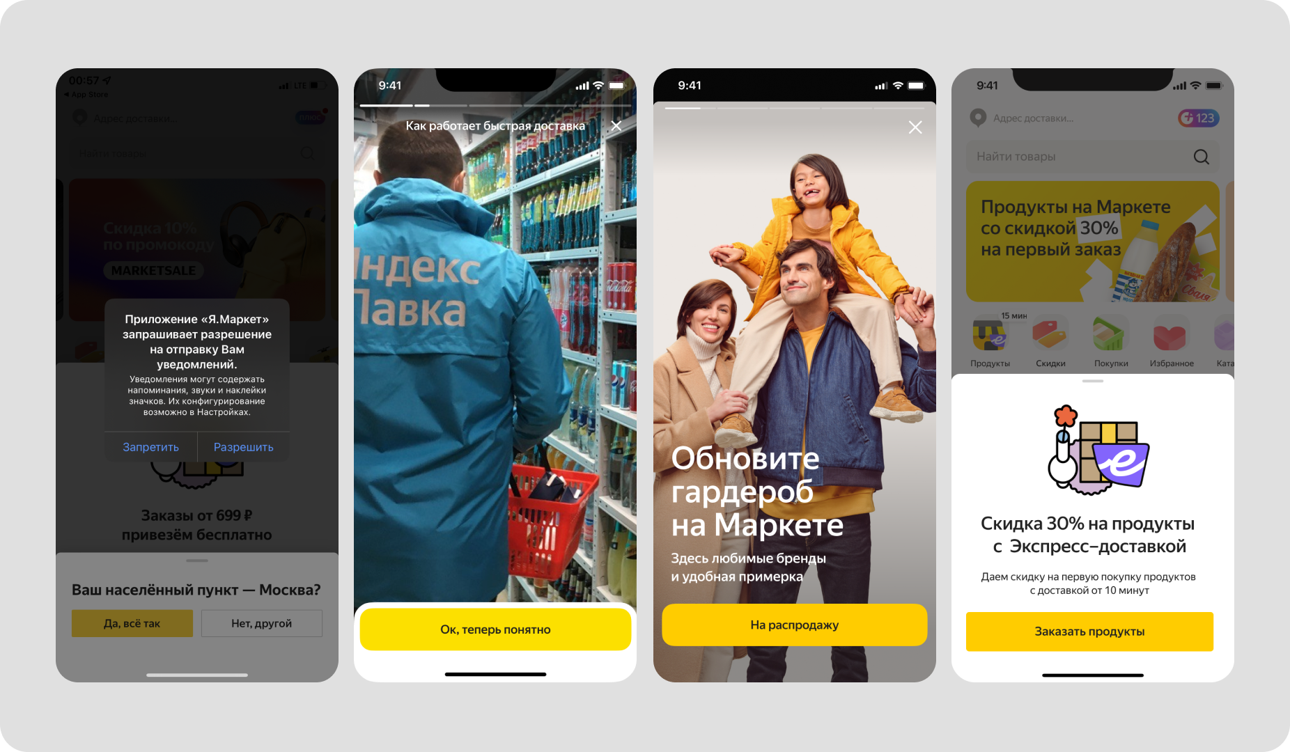
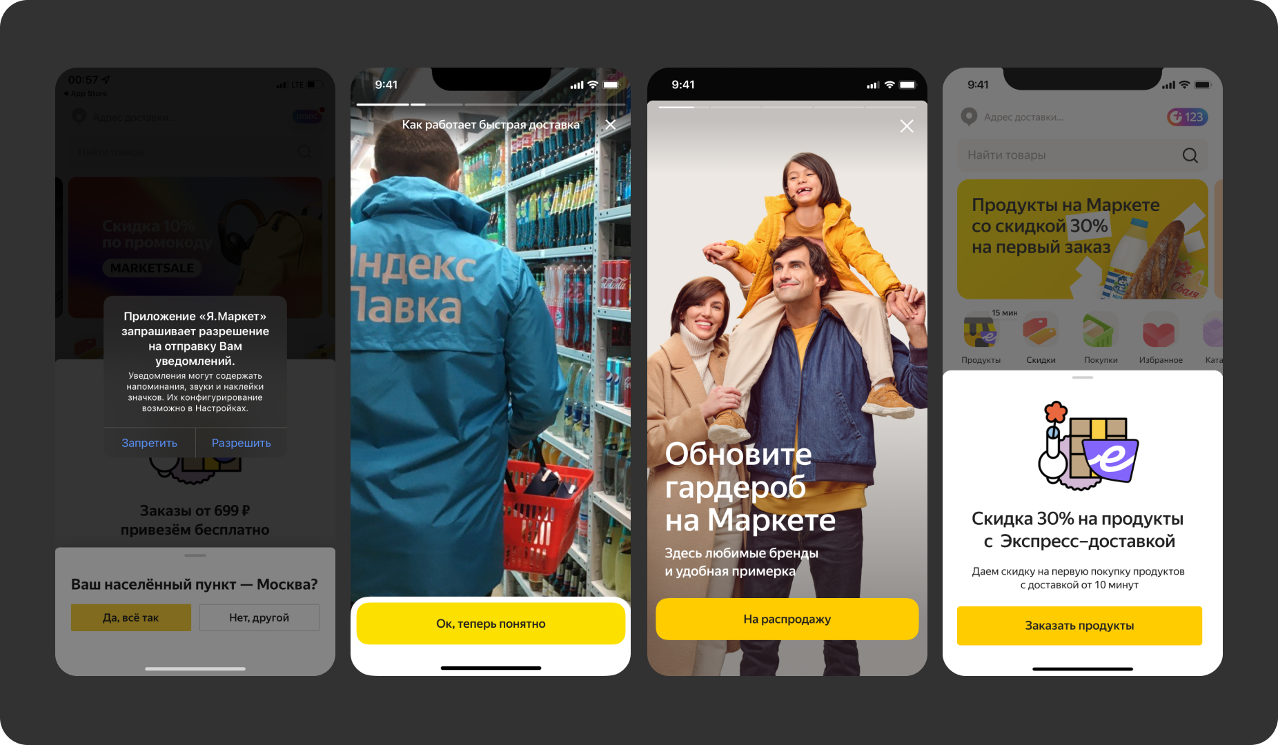
Before: no shared format, no priority.
The goal was simple to state and hard to execute: bring every message into one system, with clear signals for users and a shared toolset for every team.
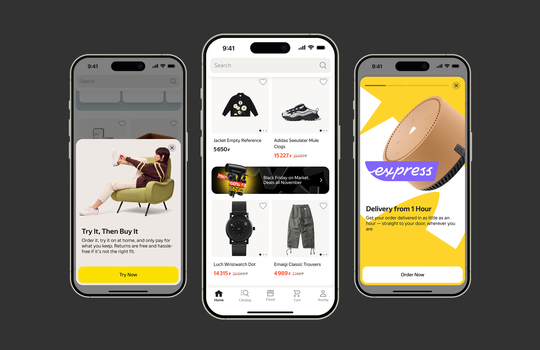
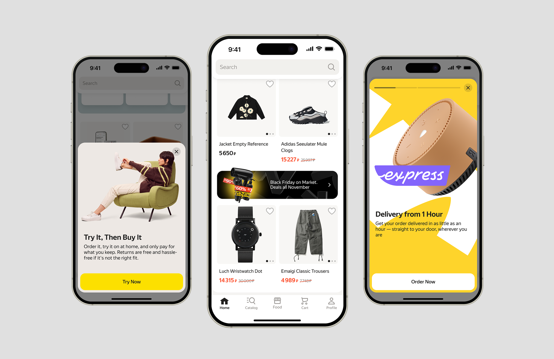
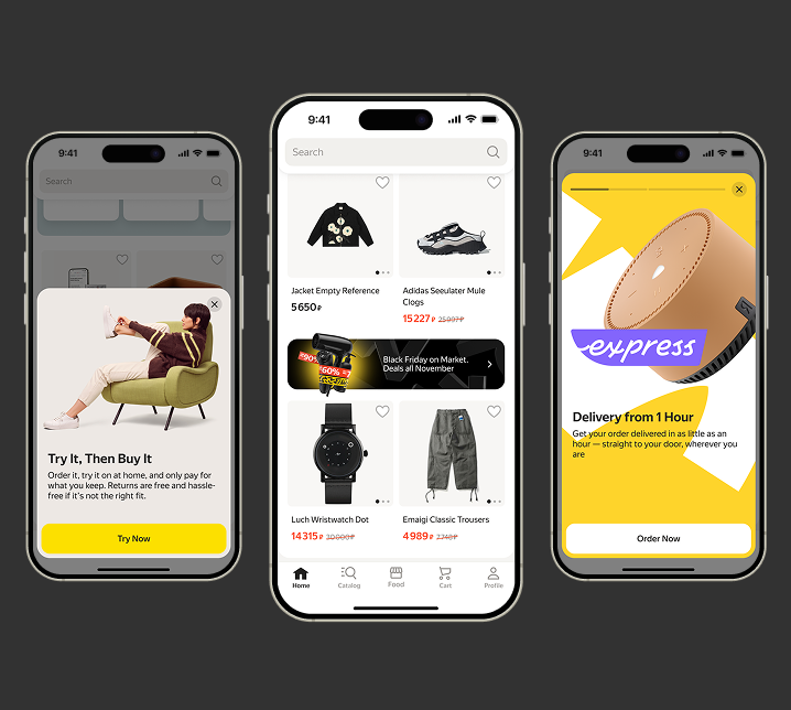
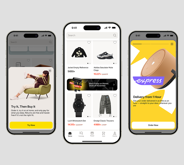
I designed three levels — S (inline banner), M (bottom sheet), L (fullscreen) — so the format scales with how important the message is.
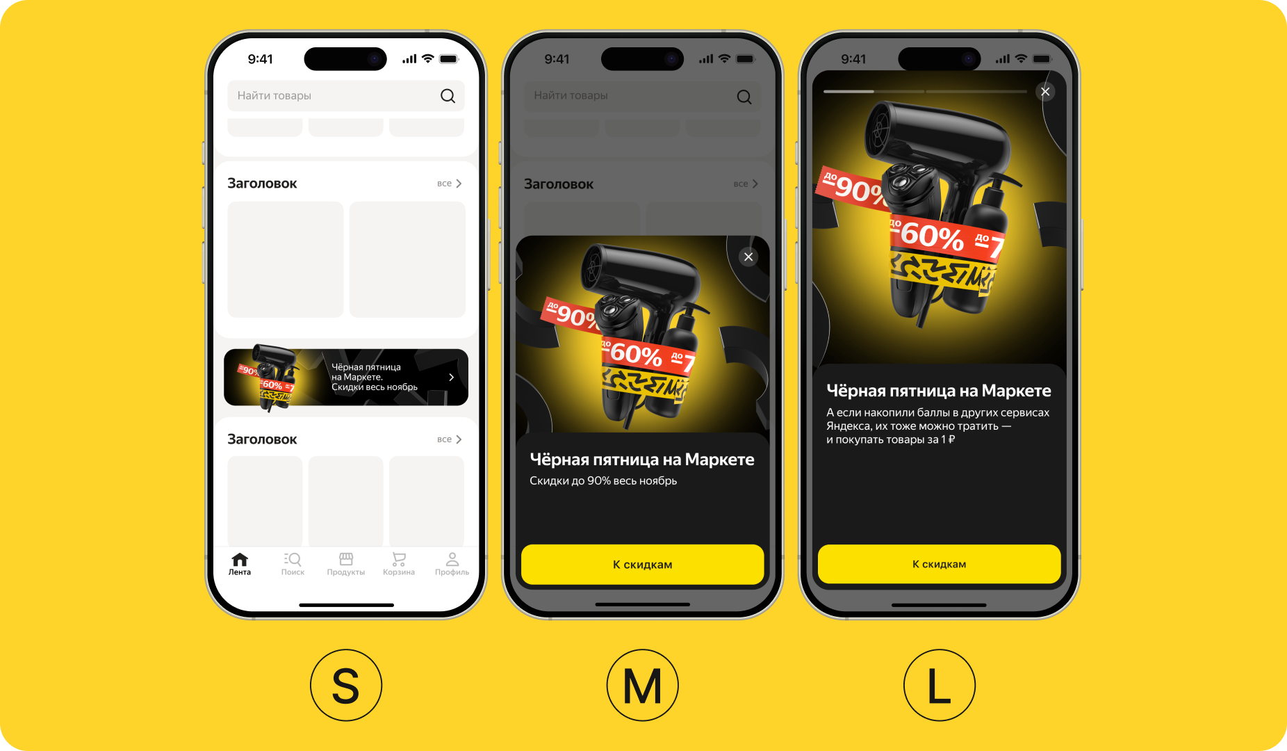
Three formats, one system
Each format comes with strict display rules — a quiet period after a dismissed overlay, and a lighter UI you can swipe away instead of hunting for a close button, so dismissing a message never feels like friction.
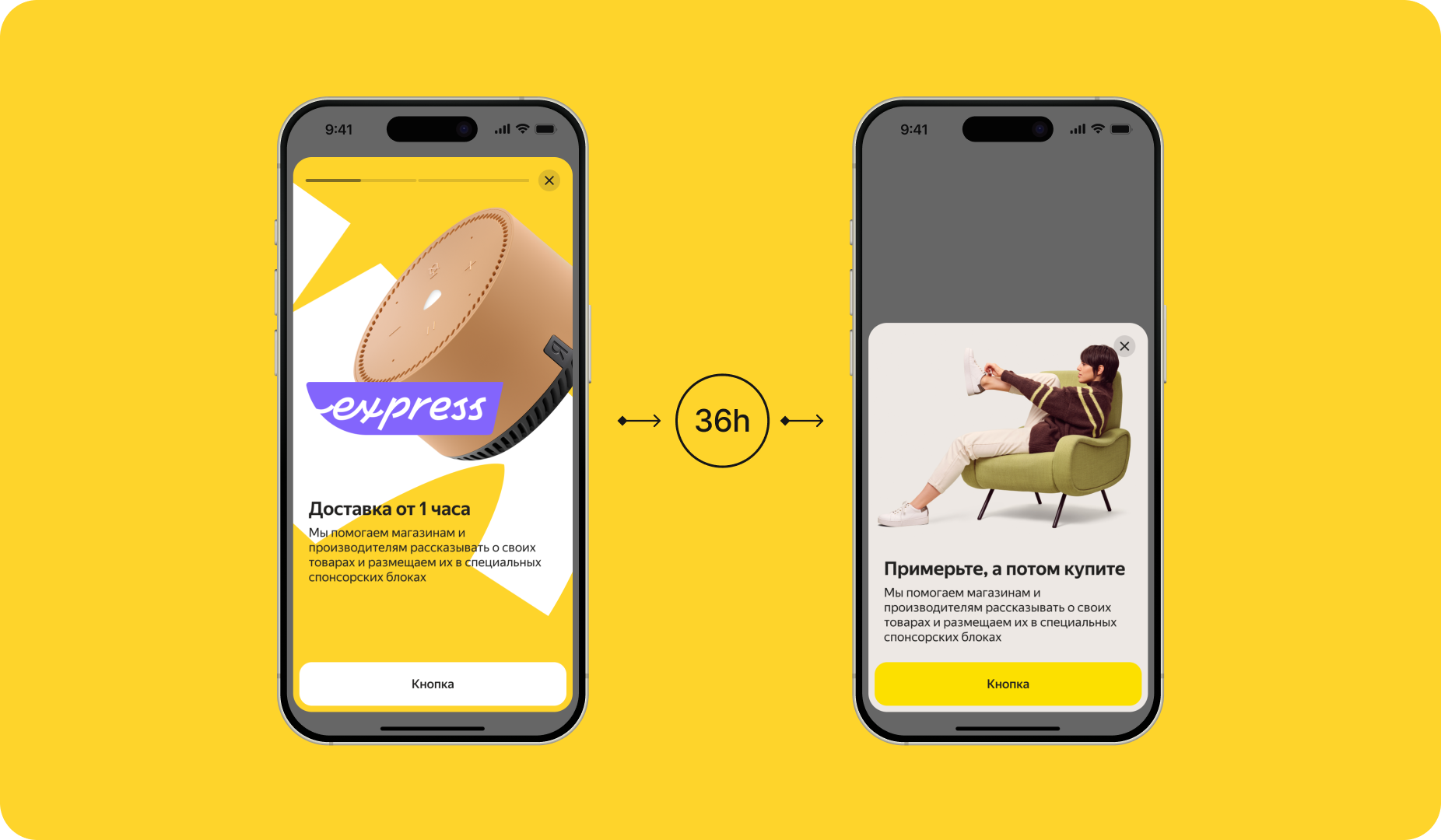
A cooldown window prevents repeat interruptions
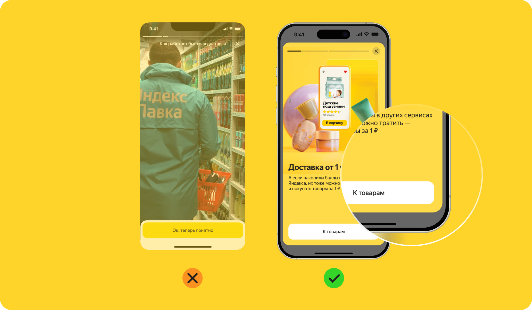
Swipe to dismiss — no X needed, less friction before every announcement
Behind the formats sits a conditions matrix — user type, context, trigger, and state — with documented usage rules so every team applies the system the same way, on both mobile and desktop.
Onboarding got the same treatment. The original flow ran 7 screens, and most users never made it to the end.
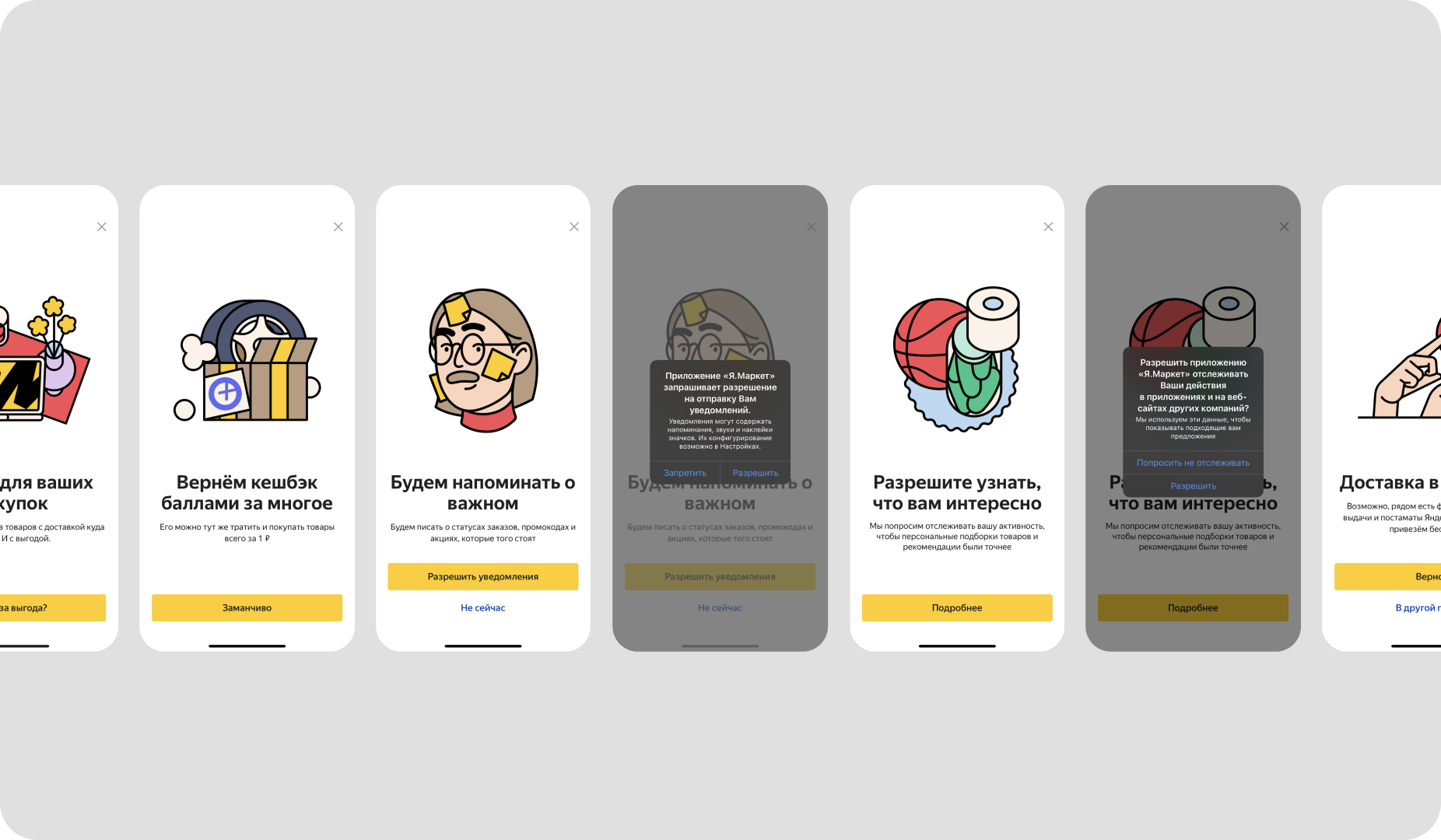
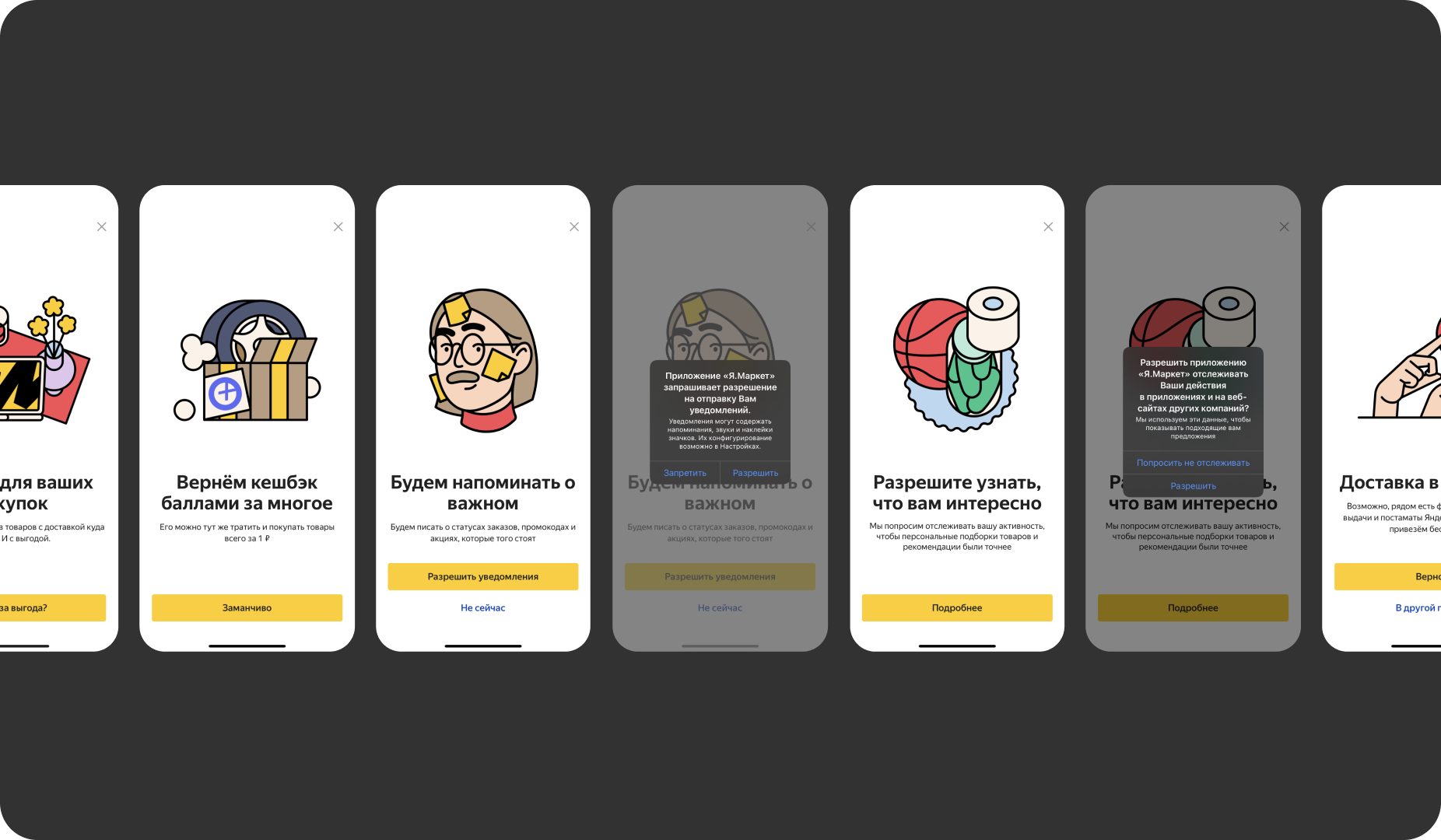
Before: 7 screens, most users never finished
I rebuilt it into 3 screens, testing each version with real users in UX sessions.
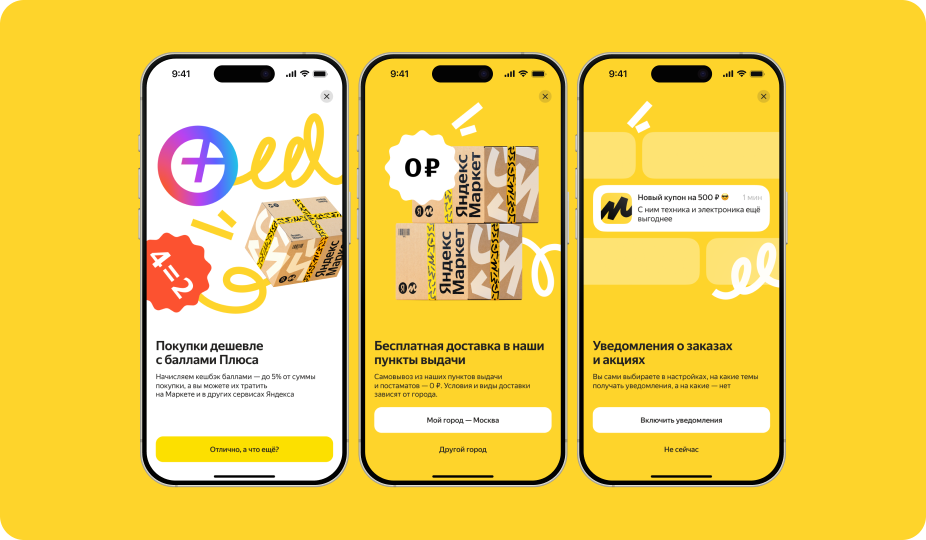
After: 3 screens, tested with real users
The system was adopted across every product team as their shared tool for feature and promo announcements — and onboarding time was cut in half.